Johnnycantsurf
Johnnycantsurf
Johnnycantsurf
Johnnycantsurf
Johnnycantsurf
2017
2017
2017
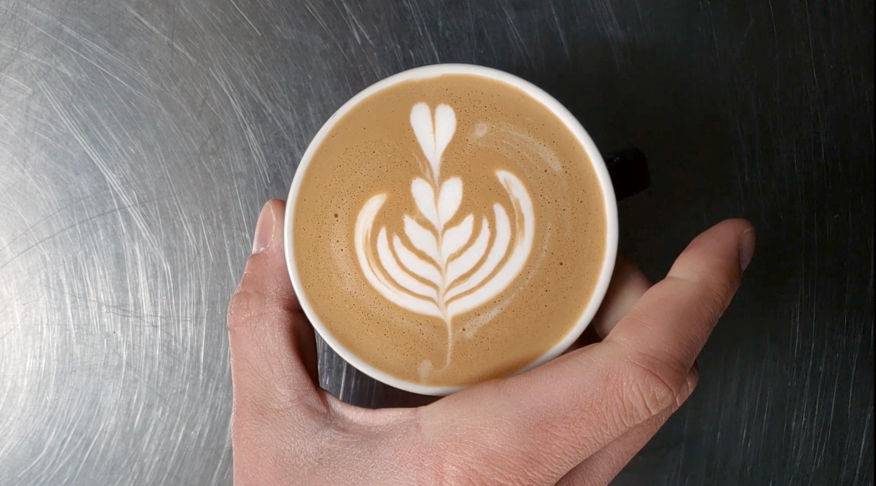
Johnny Kim is an outstanding barista and hardcore surfer. Putting his surfing dreams on hold to pursue his love for coffee led him to start Johnnycantsurf — a delightful coffee truck business.
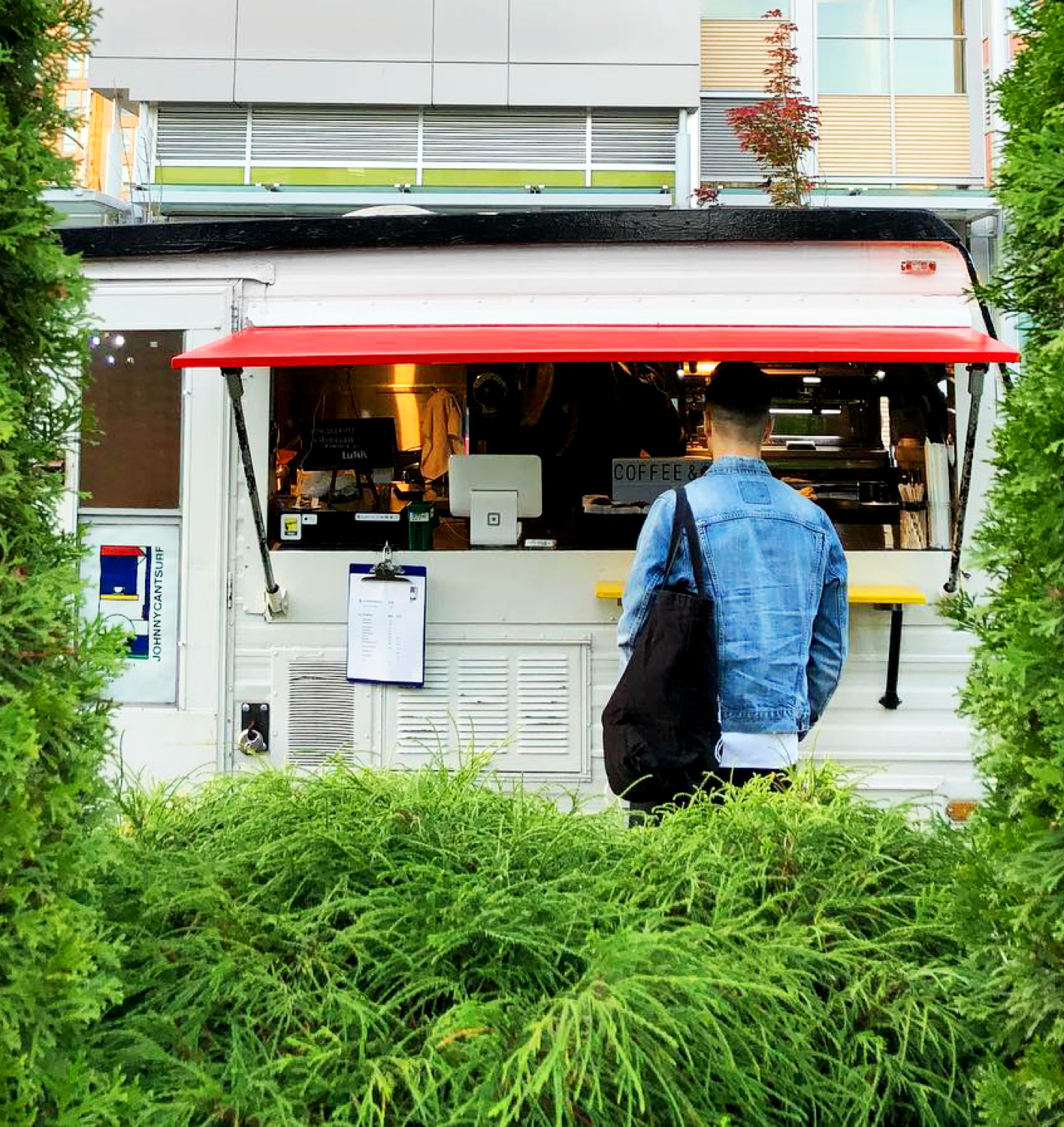
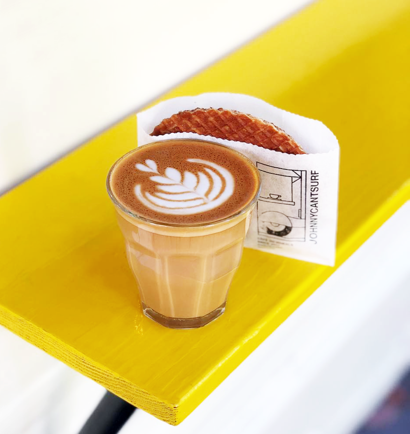
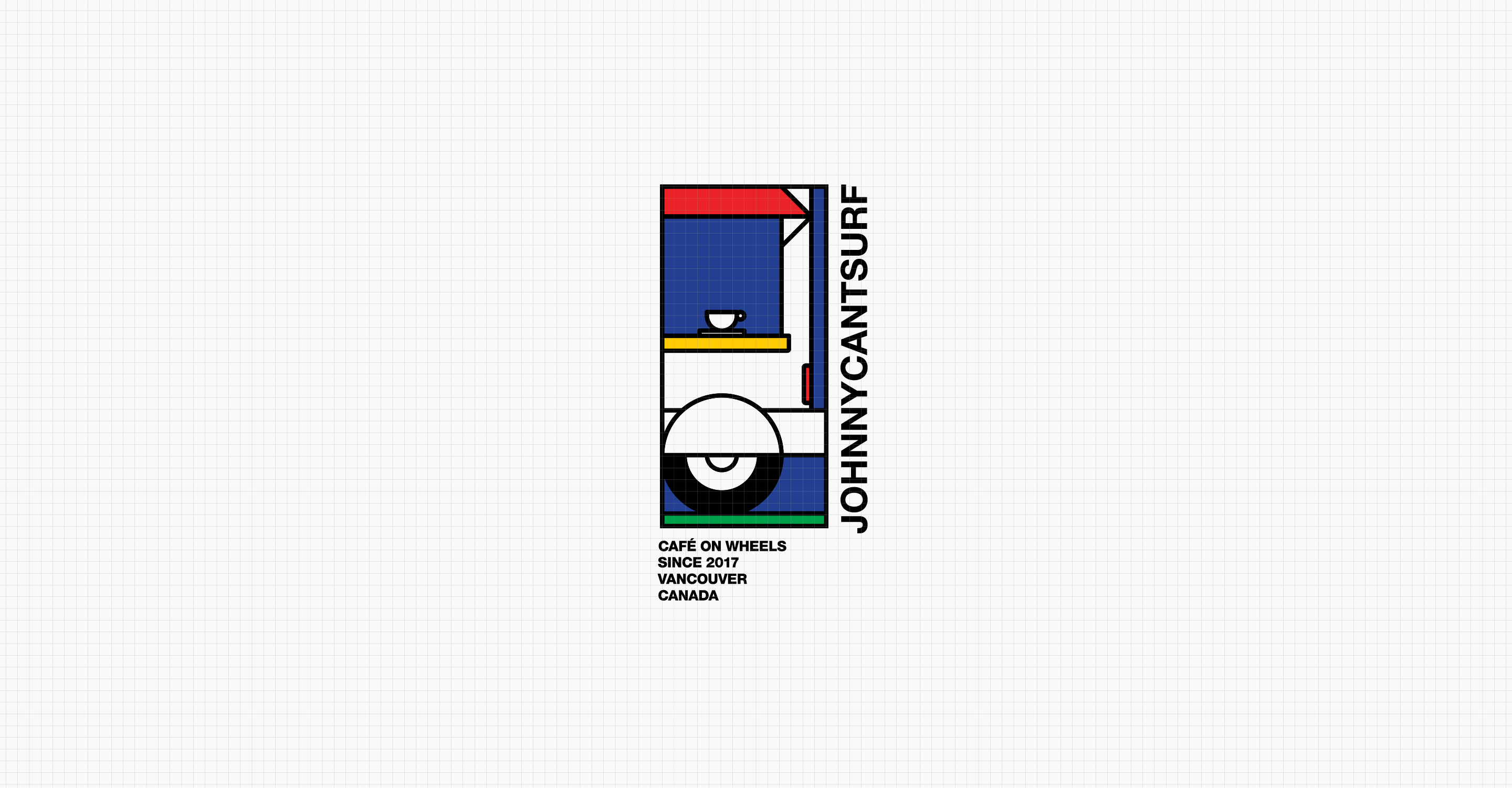
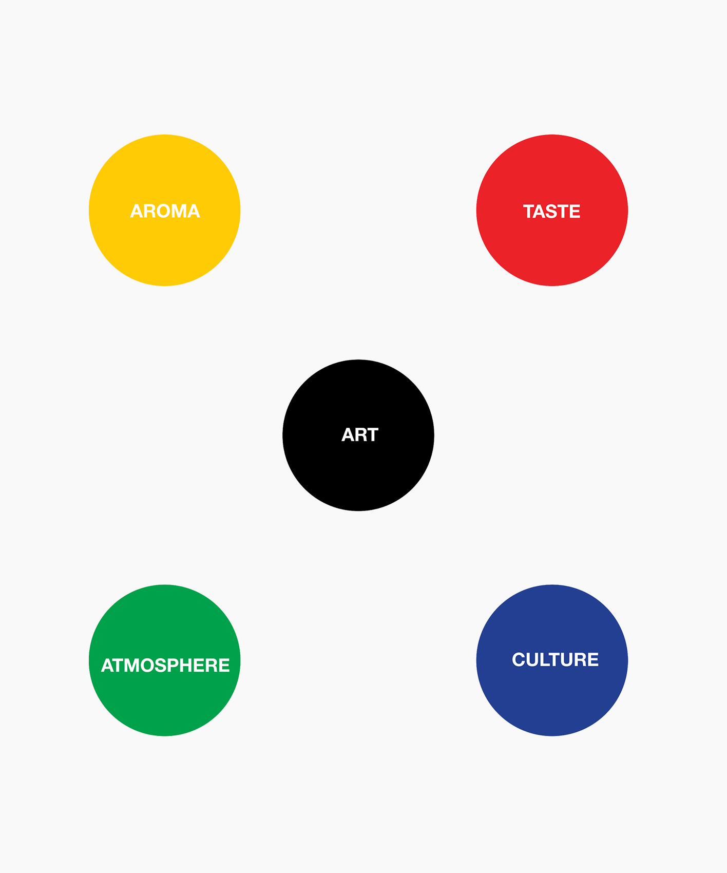
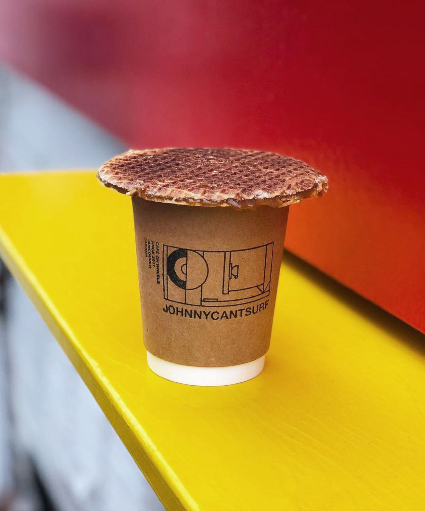
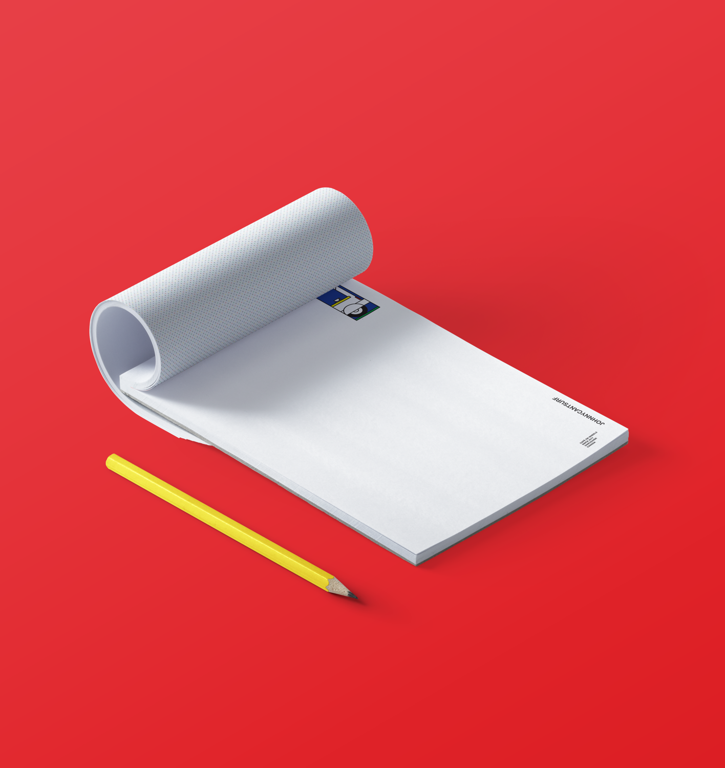
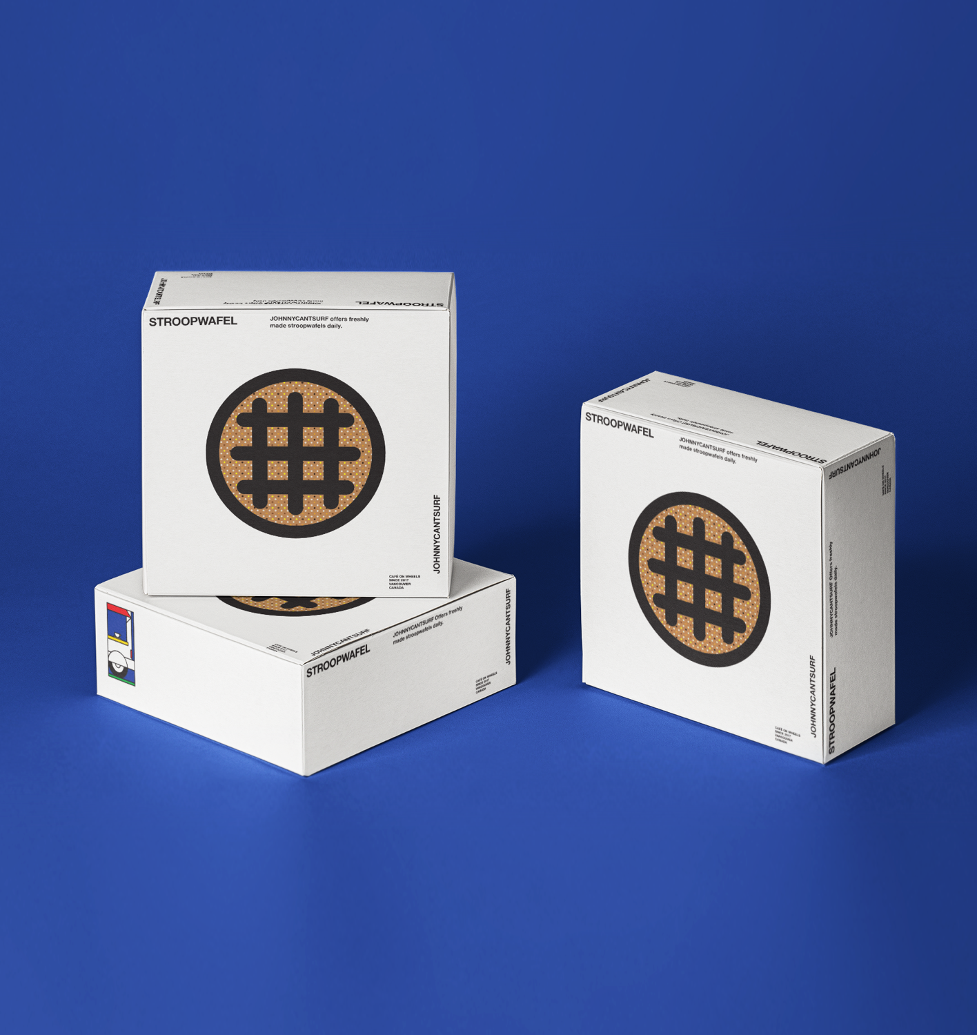
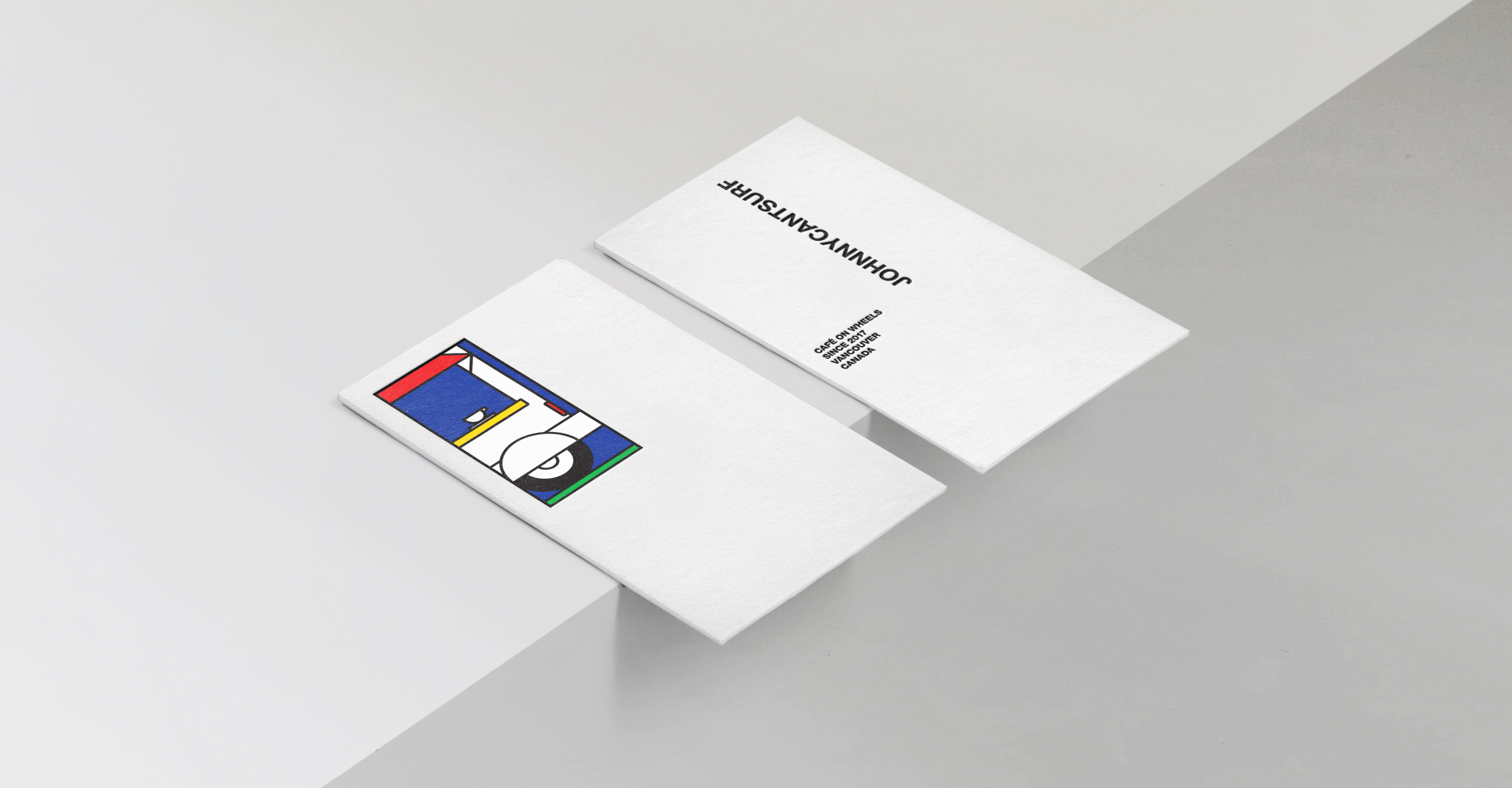
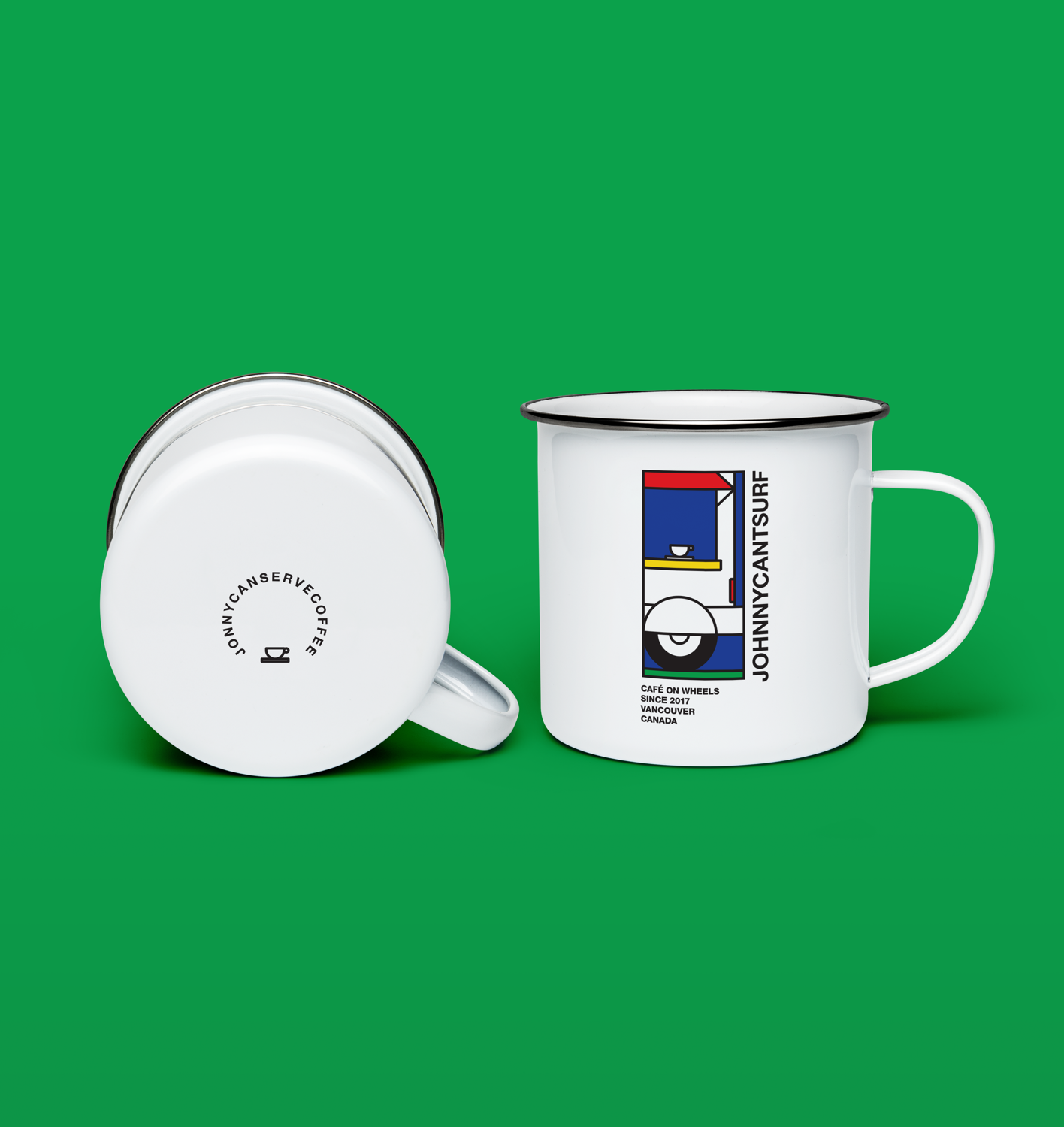
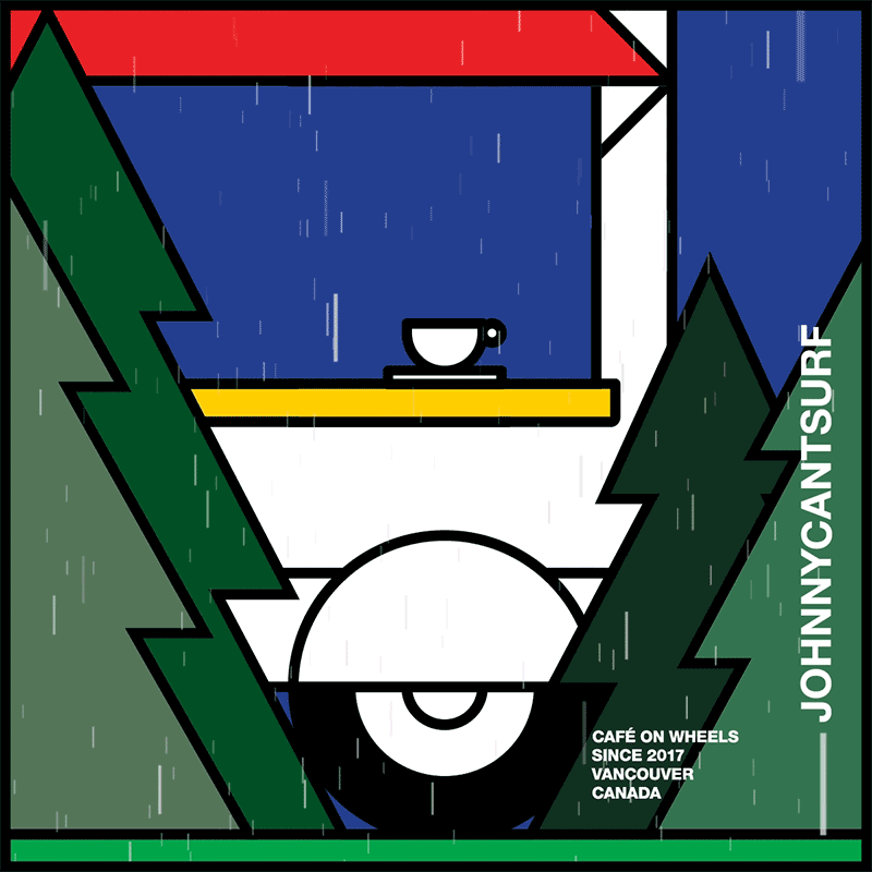
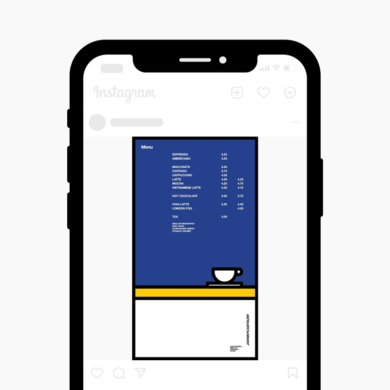
As the sole designer and art director of the project, I felt it was important to partner with Johnny to create a recognizable and energetic visual identity of Johnnycantsurf. Research showed that coffee is enjoyed through taste, aroma, atmosphere, and culture. Joining that knowledge with artistic expression, I created a branding identity that gives a nod to pop art. Primary colors and minimal geometric design formed the basis of Johnnycantsurf’s branding. I convinced Johnny to extend this visual language to the coffee truck, which eventually served as its own advertising, and ultimately became the cherry on top of Johnnycantsurf’s visual identity cake.
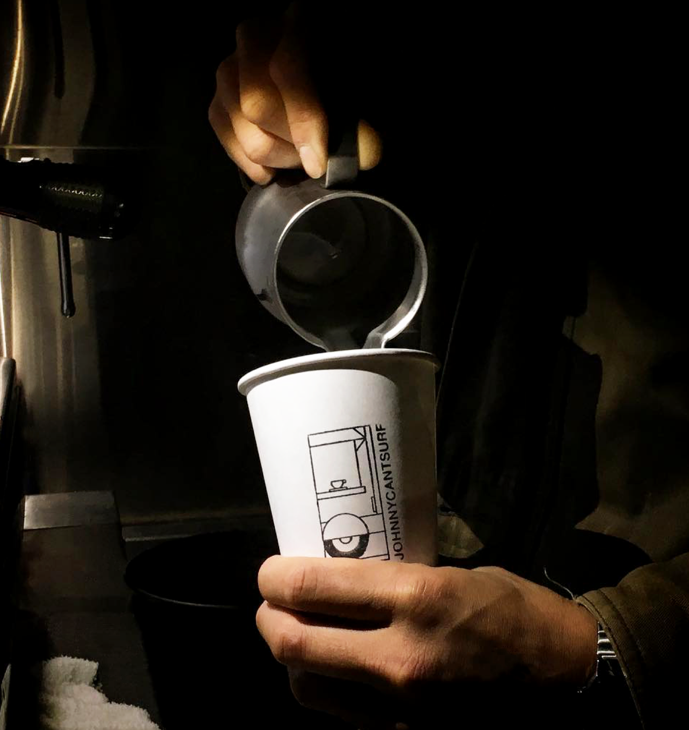
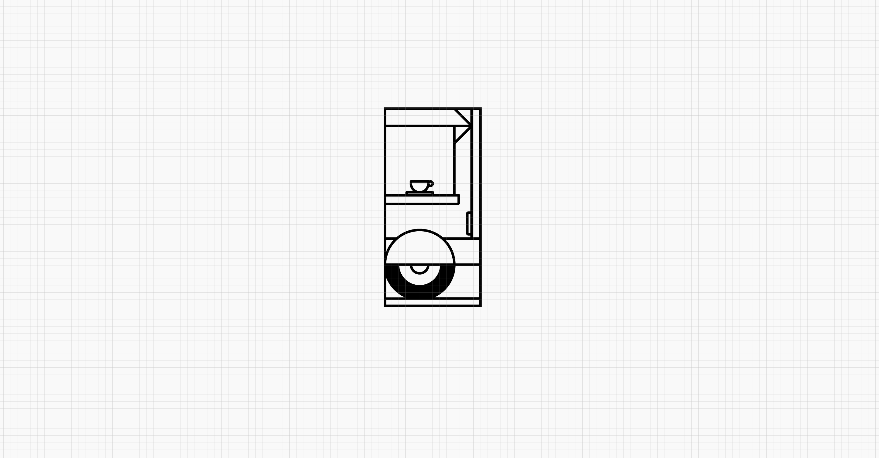
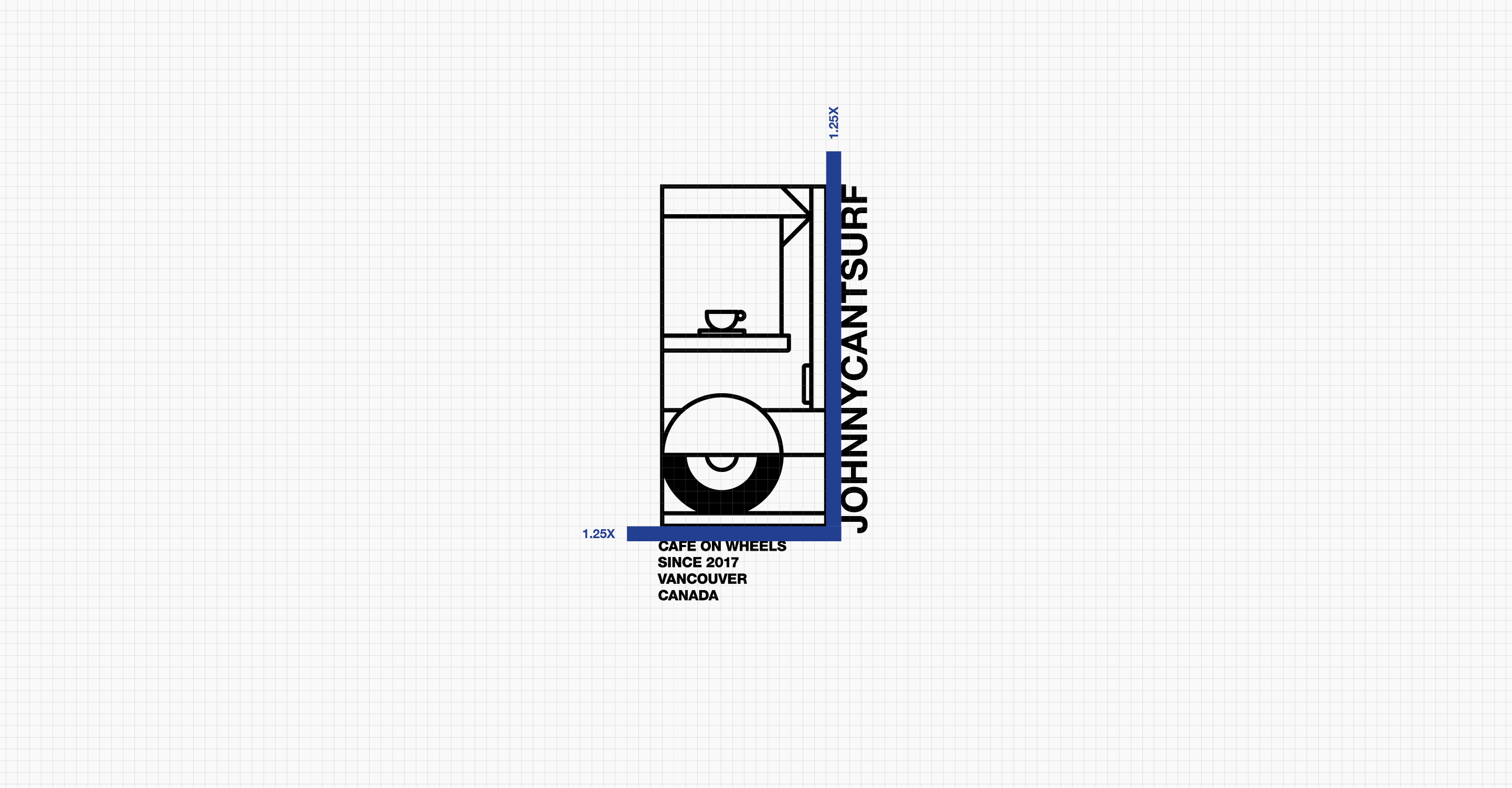
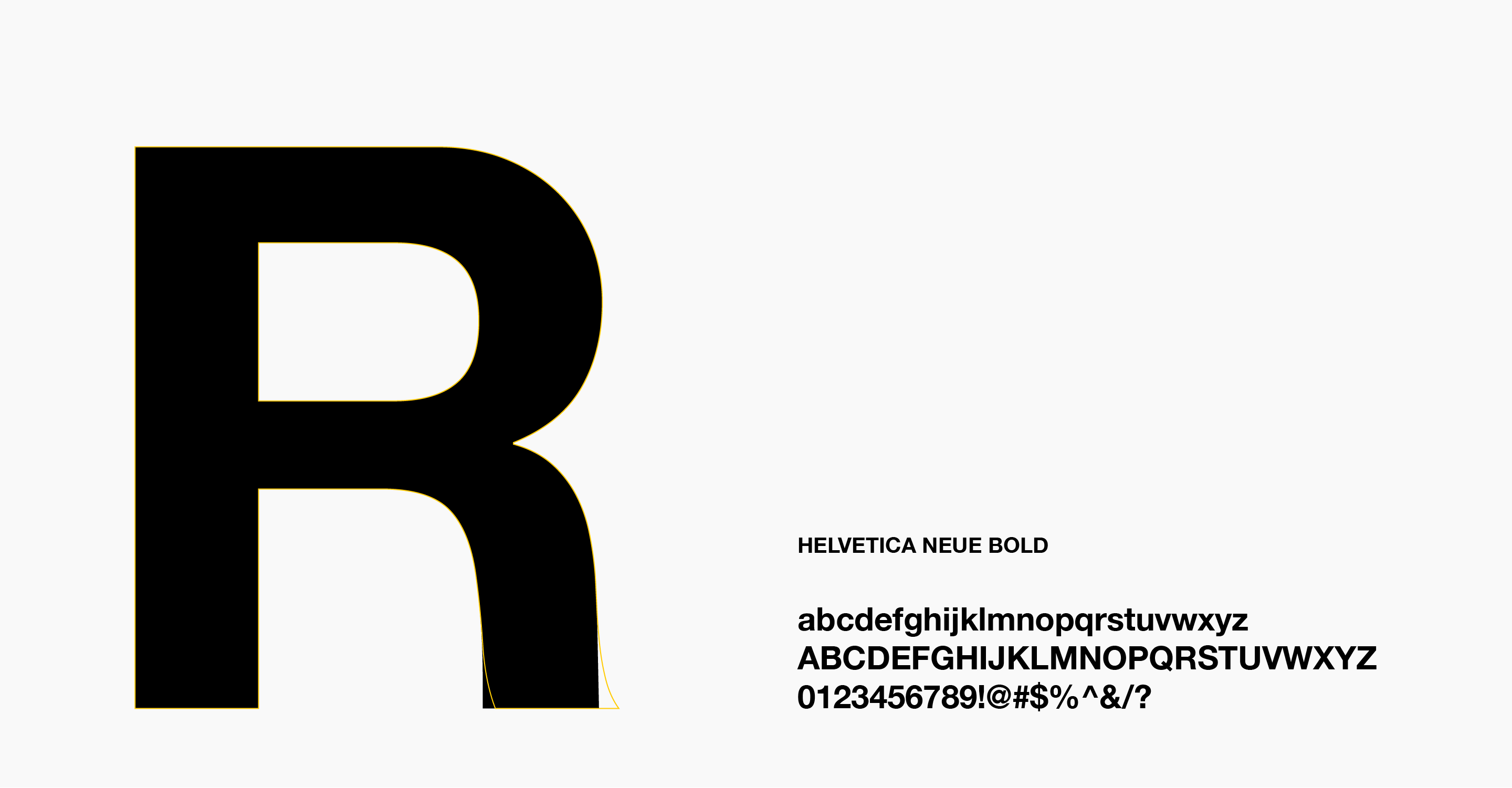
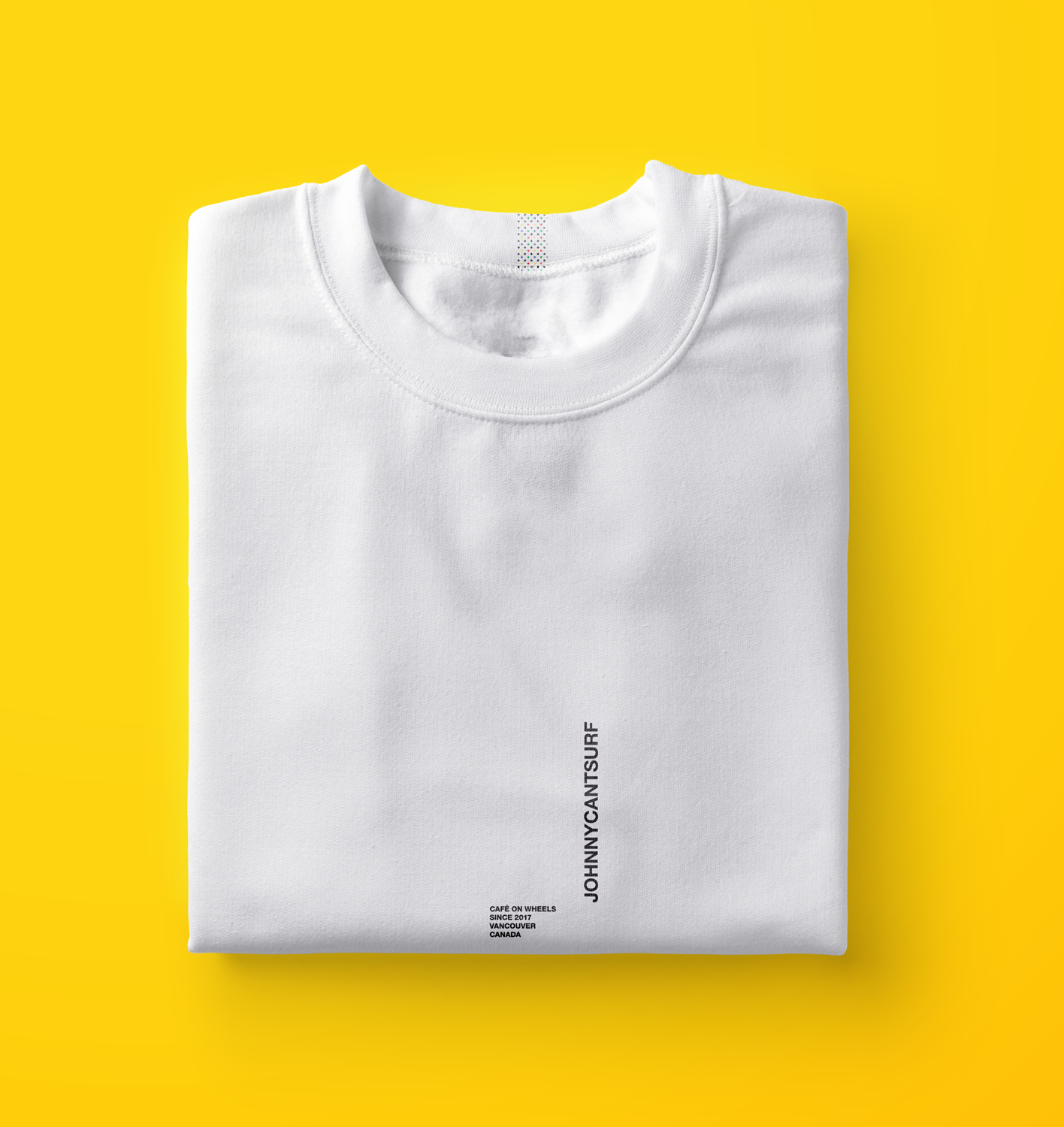
The Johnnycantsurf logo is designed in a flexible system where the logo and wordmark can work separately, often to evoke the feeling of three-dimensionality. This usage is evident throughout the plethora of Johnnycantsurf merchandise, social posts, and packaging.
Johnny Kim is an outstanding barista and hardcore surfer. Putting his surfing dreams on hold to pursue his love for coffee led him to start Johnnycantsurf — a delightful coffee truck business.
As the sole designer and art director of the project, I felt it was important to partner with Johnny to create a recognizable and energetic visual identity of Johnnycantsurf. Research showed that coffee is enjoyed through taste, aroma, atmosphere, and culture. Joining that knowledge with artistic expression, I created a branding identity that gives a nod to pop art. Primary colors and minimal geometric design formed the basis of Johnnycantsurf’s branding. I convinced Johnny to extend this visual language to the coffee truck, which eventually served as its own advertising, and ultimately became the cherry on top of Johnnycantsurf’s visual identity cake.
The Johnnycantsurf logo is designed in a flexible system where the logo and wordmark can work separately, often to evoke the feeling of three-dimensionality. This usage is evident throughout the plethora of Johnnycantsurf merchandise, social posts, and packaging.

© Matthew Kim
© Matthew Kim
© Matthew Kim
© Matthew Kim
© Matthew Kim